A brand identity is not a logo. It is a complete system of visual elements that work together to make a business recognizable, distinctive, and consistent across every customer touchpoint. Building a brand identity that works — and that lasts — requires strategic thinking, creative excellence, and disciplined implementation.
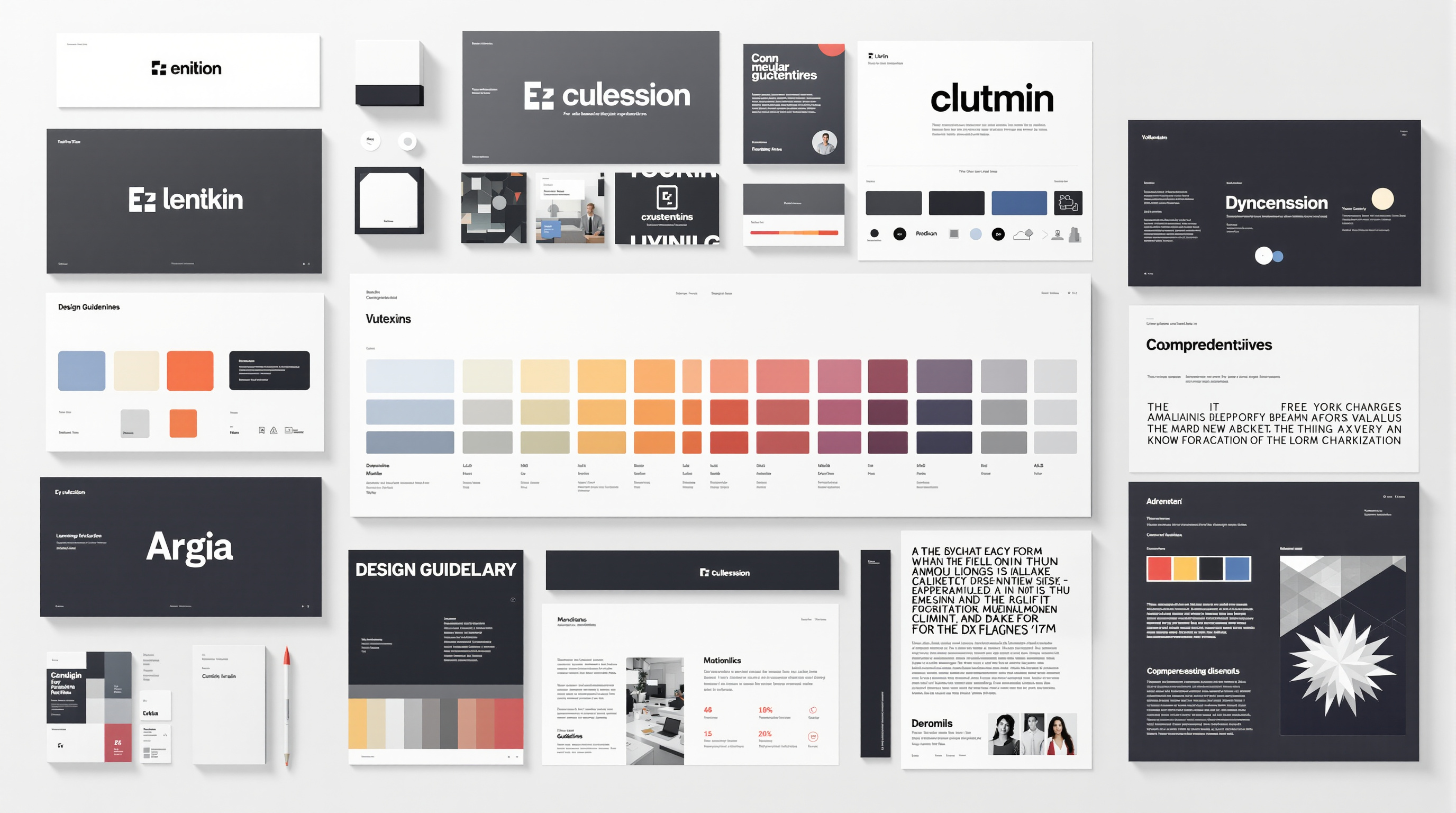
The Components of Brand Identity
- Logo: The primary mark — usually a combination of a symbol and wordmark — that serves as the brand's visual signature
- Color palette: A defined set of primary and secondary colors, specified for both print (Pantone/CMYK) and digital (RGB/Hex) applications
- Typography: Primary and secondary typefaces with defined usage rules for headlines, body text, captions, and display applications
- Imagery style: Guidelines for the style of photography, illustration, or iconography that represents the brand
- Design vocabulary: Recurring design elements — patterns, textures, shapes, graphic devices — that create visual continuity across applications
Logo Design Principles
A great logo works in one color, in black and white, at very small sizes, and at very large sizes. It is distinctive enough to be recognized at a glance, but simple enough to be reproduced in any medium. Timeless logos tend to be conceptually grounded rather than aesthetically fashionable. A logo grounded in the brand's core concept has the potential to work for decades.
Color Psychology in Brand Identity
Color is the most emotionally powerful tool in the brand identity toolkit. Research in color psychology — including work compiled by the Pantone Color Institute — shows that different colors consistently evoke different emotional responses: blue communicates trust; red communicates energy and urgency; green communicates nature and health; black communicates sophistication and premium positioning.
Color choices must be made in the context of competitive differentiation as well as emotional resonance. If all competitors in a category use blue, choosing blue will help you blend in rather than stand out.
Brand Guidelines Documentation
A brand identity is only as good as its implementation. Brand guidelines documentation is the solution: a comprehensive reference document specifying exactly how every element of the identity should be used in every application. Good brand guidelines include clear visual examples, specific color and typography specifications, usage rules (including what NOT to do), and templates for common applications.
Evolving a Brand Identity
Even the strongest brand identities require periodic evolution. Markets change, companies evolve, and design standards advance. The challenge of brand identity evolution is maintaining core recognition while updating the execution — keeping what is distinctive and valuable while refreshing what has become dated. Major identity overhauls are rarely necessary or wise. Most established brands are better served by evolutionary refreshes that maintain the core equity while updating specific elements. The goal is always to build on what is already recognized rather than starting over from scratch.